Actually, The New Jets Alternate Is Great

5 years ago
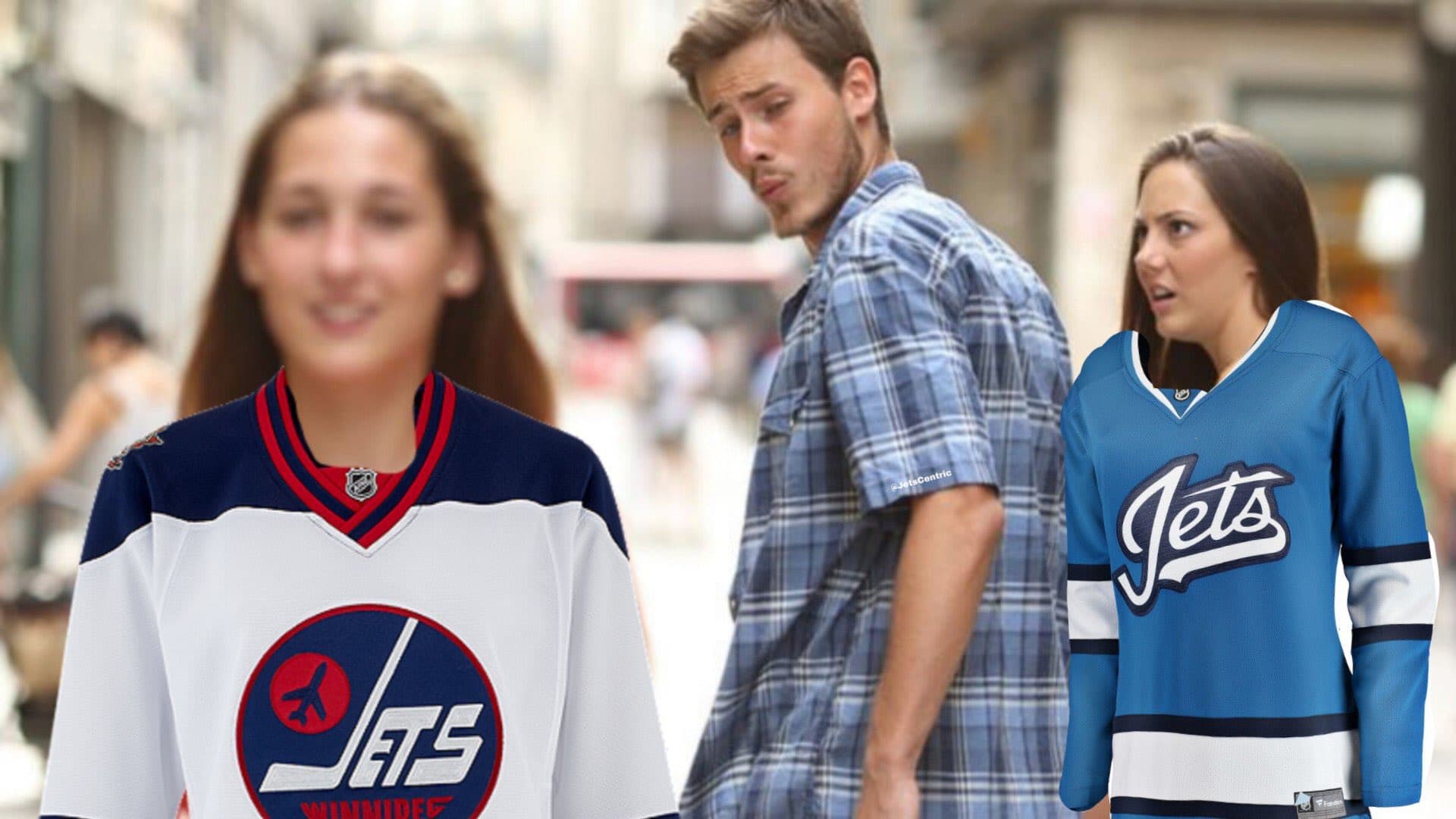
Ever since the image of the Jets new third jersey leaked Thursday morning, reaction has been swift and harsh as the internet got its collective Jay Sherman on and declared in one almost unified voice: “It Stinks”
But I’m here to tell you the internet is wrong and that the Jets new alternate jersey is in fact great.
(btw, much love to the JetsCentre.ca crew and @JetsCentric podcast for the hilarious picture that perfectly sums up the reaction)
https://www.instagram.com/p/BnvbaVSHIGp/
The complaining of the jersey seems to breakdown over two issues with it…
It’s Boring
Yes, it sure does lean heavily on the concept of minimalism and that’s a valid argument. Personally I feel as though they could have added something to the shoulders. A contrasting yoke, patches on each side… Something just to make it a little less “boring. A few fans had the same idea and tinkered around with the leaked jersey image.
A simple addition like that could have allowed the Jets and Adidas to still hold on to the “traditional classic” vibe they were aiming for with the jersey while punching up the look a little bit to make it not feel like a jersey you would find hanging on a Walmart rack for $30 bucks.
The jersey isn’t helped by a rather plain script logo either. The subtle use of a jet outline on the “T” is a very sweet touch, but it’s perhaps a bit too subtle. Maybe if the “vapor trail” behind the jet was a little narrower or if the jet itself was a slightly different color (Silver?) just to make it stand out a little more.
What if they left the word “WINNIPEG” in the tail of the S? The keychains the Jets handed out to season ticket holders had the word included and various merch beyond the jersey being sold includes the word…
The problem is, if you’re aiming for a minimalist look, then adding all those things I just mentioned as possible changes doesn’t make it minimalist. There is something to be said for a jersey or a logo that doesn’t have a dozen hidden meanings or elements to it.
Remember the Oilers failed “comet” logo? Did you know how many hidden meanings that dumb thing had? *takes deep breath* The three tails represented three decades of Oilers hockey and also speed! The five rivets were for the five championships won. Each gear tooth represents the captains they had up to that point. The silver was for the Stanley Cup. The Oil drop was still the oil drop but it was made to look more like actual oil.
You probably don’t remember any of that because no one really cared and if the idea was to jam a bunch of those elements together first and worry about design later, then the awful looking result was well earned.
There is beauty in simplicity.
It’s not “Heritage-y” enough!
The biggest complaint is that the Jets simply didn’t go back to an older Jets 1.0 look. They didn’t use an variant of an old logo, they didn’t include red
This should really be it’s biggest complement. Thank goodness they refused to take the lazy way out and just take a bunch of elements from an era of Winnipeg hockey which to be quite frank shouldn’t bring up as much nostalgic pining as it does.
Not that you probably need the reminder but THIS team isn’t THAT team. This current club traces it’s roots back to Atlanta and the Thrashers, not to the WHA and the Avco Cup. This current club wins playoff series and makes it to the Western Conference Final, not fail to get past the first round.
This team needs to make it’s own history, have it’s own traditions and leave the past in the past. That’s what this jersey does.
Not that they didn’t do a few nods to that past. The wordmark logo actually borrows elements of the large “J” and a plane streaking across the logo that has been featured on pretty much every other logo.

Photo Credit: Icethetics.co
The stripes along the bottom of the jersey are a nod to the Jets 90’s era uniform and have the same location and thickness to them, but lack the red.
There is just enough nods to the past without it being overly obvious. This is what makes the jersey great and one that should be admired, not scorned.
And besides, it was revealed that the Jets are still going to have that heritage jersey kicking around.
Is that better for you fans who just wanted a simple re-hash of the 80s? The Jets aren’t fully eliminating it. It would be nice if it was brought out more than one time, but as Chipman alluded to during the Fan Forum, it’s super tough to ask opposing teams to bring in their dark color uniforms for just one game, especially if they are in the middle of a road trip.
You can’t please everyone
Like anything on the internet, you can’t make everyone happy and there are always going to be detractors, but the level of displeasure over this jersey that is bordering on hate – one National Post writer called it the worst jersey he’s ever seen which makes me think he’s never seen the Mighty Ducks Wild Wing jersey – is kind of astonishing.
I personally think the Jets and Adidas got this one very right. Maybe once the Jets start winning games in them you’ll change your tune (heaven help us if they lose the first two or three games played in them) and in time maybe you’ll come to appreciate the jersey as well.
Recent articles from Art Middleton